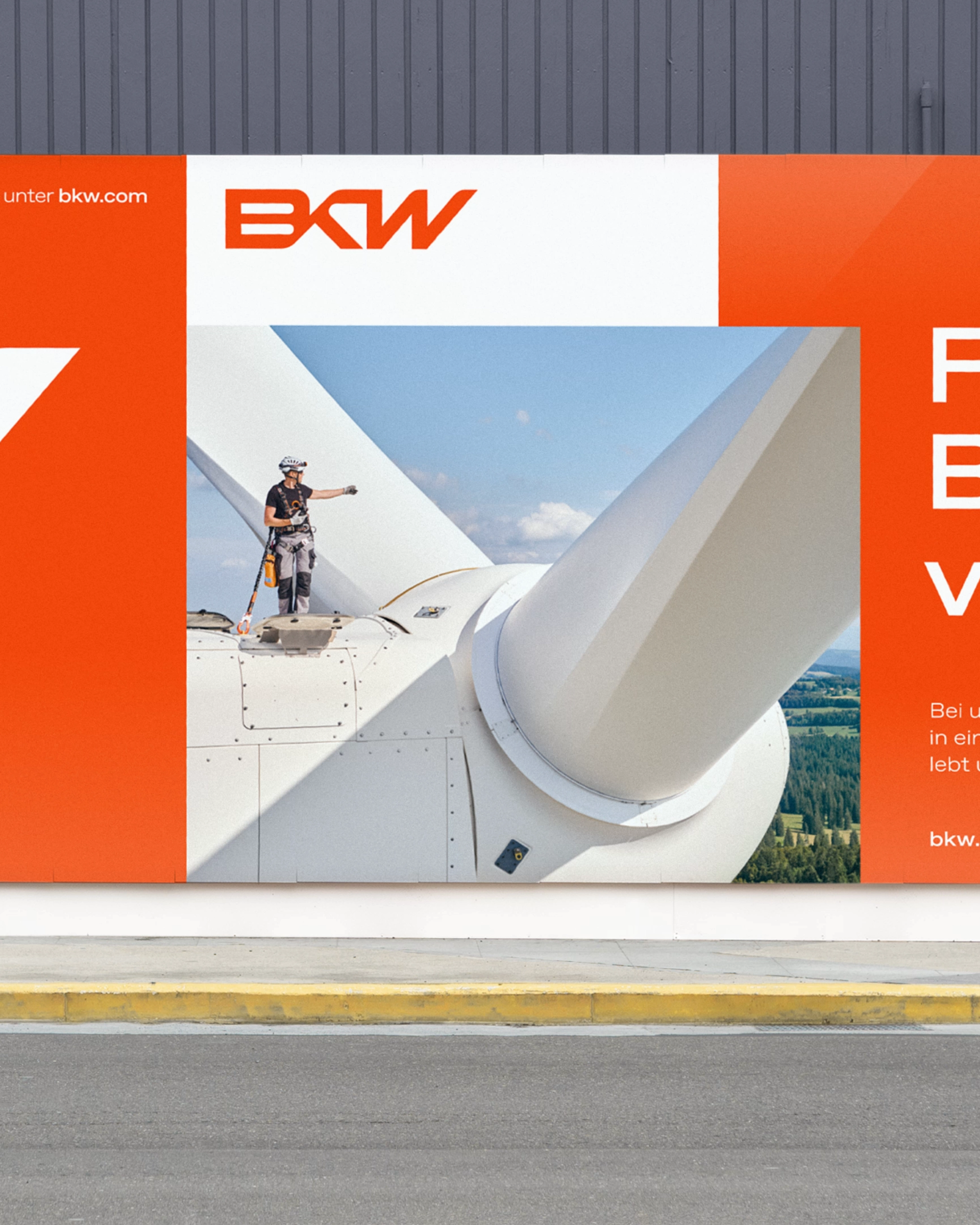
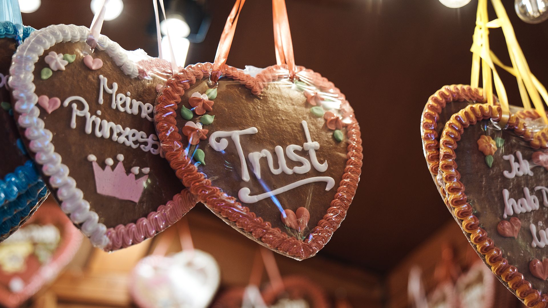
A modern, open-source sans-serif typeface

Together with René Bieder we've built a typeface for the way we think: precise, direct, a little stubborn.
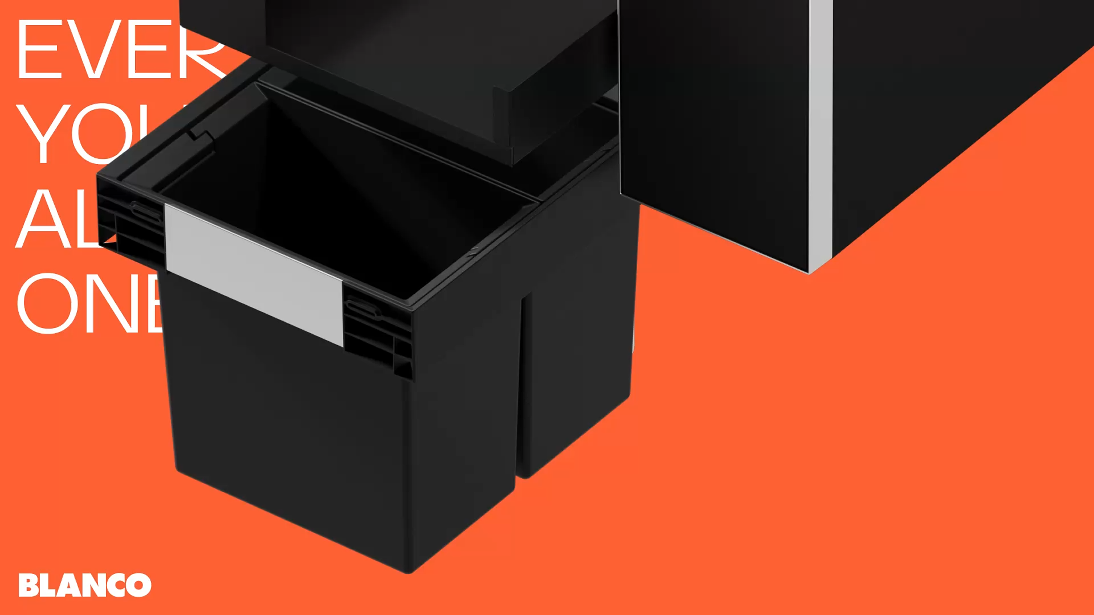
And it's a bit like ourselves: generous by nature. But time to meet the whole family. Be nice, they've heard a lot about you.
Monospaced Variant
We built a typeface for the way we think: precise, direct, a little stubborn. Now it’s available for your projects too.
Sans Variant
We built a typeface for the way we think: precise, direct, a little stubborn. Now it’s available for your projects too.

Feel free to explore our own identity all across the place
- Google Fonts
Strichpunkt Sans is ready when you are. Embed it directly from Google Fonts and it runs on your site in minutes, with no files to manage and no setup. Or download the full family to work with it locally in your layouts, presentations and prototypes.
- GitHub
Every letter in Strichpunkt Sans is a decision we made, and every decision can be questioned. That’s why the source sits on GitHub, in the open. Found a glitch? Tell us, and we’ll fix it. Missing a character your language needs? Suggest it.